
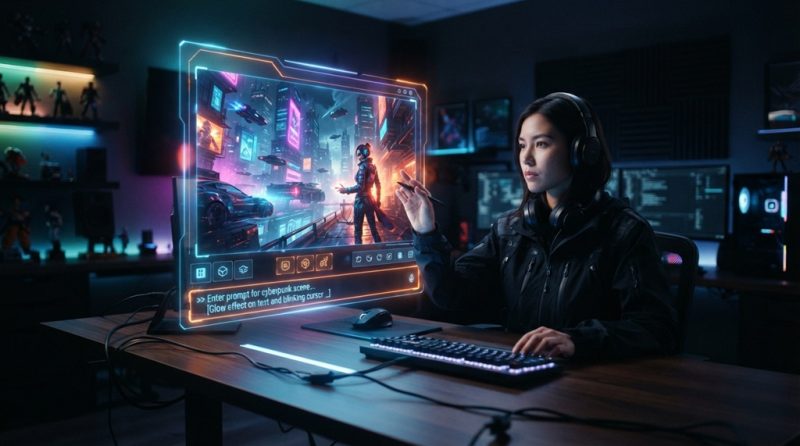
Generating stunning AI images like a professional designer comes down to three things: writing structured prompts instead of vague ones, understanding how the model “thinks” about light and composition, and editing your results instead of accepting the first output. Anyone can type a sentence into an AI image tool and get something. Getting an image that looks intentional, polished, and portfolio-ready is a different skill and it’s one you can learn in an afternoon.
The gap between an amateur AI image and a professional-looking one usually isn’t the tool. It’s the process. Designers who get consistently great results treat AI image generation like a craft with repeatable steps, not a slot machine you pull until something good comes out.
This guide breaks down exactly how that process works, from prompt structure to post-processing, so you can start producing images that look like they came from a design studio instead of a random generator.
Understand How AI Image Models “Read” Your Prompt
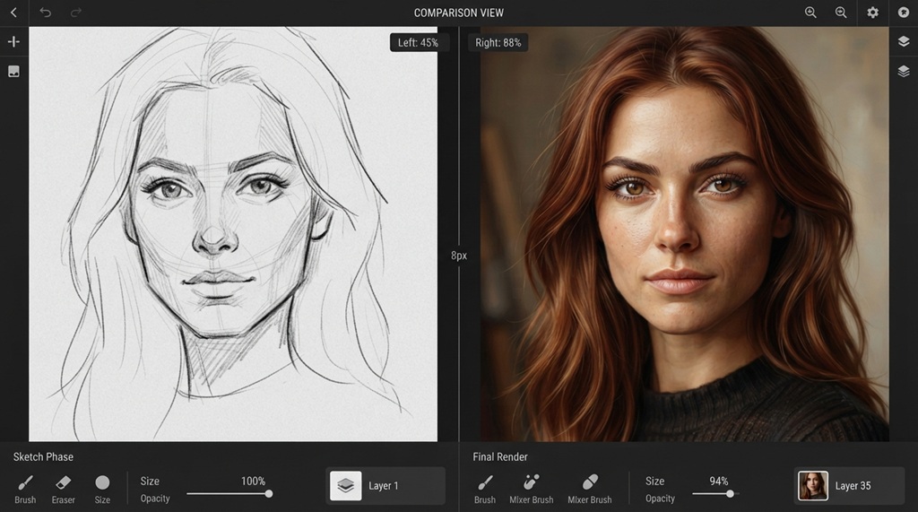
AI image generators don’t understand intent the way a human designer does they map words to visual patterns learned from training data, which means the order, specificity, and structure of your prompt directly shapes the output. Vague prompts produce generic results because the model has nothing distinctive to latch onto.
Prompts Work Best When They Follow a Layered Structure
Most professional-looking outputs come from prompts built in layers rather than a single run-on sentence. A reliable structure looks like this:
- Subject – what is the main focus of the image
- Action or pose – what is happening
- Setting/environment – where it’s happening
- Style/medium – photography, illustration, 3D render, etc.
- Lighting and mood – the emotional tone
- Technical modifiers – camera angle, lens type, resolution cues
For example, instead of “a woman in a city,” a layered prompt would read: “a woman walking through a rain-soaked city street at night, cinematic photography, neon reflections on wet pavement, shot on a 35mm lens, moody blue-orange lighting.” The second version gives the model far more to work with, which is why it produces a noticeably more polished result.
Negative Prompts Matter Almost as Much as Positive Ones
Telling the model what to avoid blurry edges, extra limbs, distorted text, oversaturation is just as important as describing what you want. Many beginners skip this step entirely, then wonder why their images look “off” in small, hard-to-name ways.
Choose the Right AI Image Tool for the Result You Want
There is no single “best” AI image generator the right choice depends on whether you need photorealism, illustration, brand consistency, or fast iteration. Matching the tool to the task is one of the biggest factors separating polished output from mediocre output.
Broadly, tools tend to specialize in different directions: some excel at photorealistic imagery and natural lighting, others are stronger for stylized illustration or concept art, and a few are built specifically for brand and marketing consistency across multiple images. According to industry experts, testing the same prompt across two or three tools before committing to one for a project is a common practice among professional designers, since each model interprets prompts slightly differently.
If your work depends on visual consistency like a series of blog headers or a product line prioritize a tool that supports reference images or style-locking features over one that only produces one-off results.
Master Composition Principles the Same Way a Designer Would
AI images look more professional when your prompt explicitly directs composition, because models don’t automatically apply design principles unless you ask for them. This is one of the most overlooked steps by beginners.
Reference Classic Composition Rules in Your Prompt
Language like “rule of thirds composition,” “centered symmetrical composition,” or “leading lines drawing the eye toward the subject” gives the model a framework to organize the scene. Without this, compositions can feel flat or randomly arranged, even if the individual elements look good.
Master Technical Precision to Elevate Visual Quality
The secret to generating pro-level AI visuals isn’t just choosing the right model—it lies in how effectively you structure your text descriptions. Elevating your image output requires mastering key composition controls; specifically, establishing a clear focal point and creating three-dimensional depth by incorporating explicit technical terms like “shallow depth of field,” “subject in sharp focus with a softly blurred background,” or “layered foreground, midground, and background.” If you want to master these foundational phrasing techniques, write better AI prompts for perfect results every time before fine-tuning your stylistic parameters.
Control Lighting and Color Like a Photographer
Lighting is often the single biggest difference between an AI image that looks amateurish and one that looks professionally shot, because lighting determines mood, realism, and visual polish more than almost any other factor.
Instead of leaving lighting to chance, describe it with the same vocabulary a photographer would use:
- Golden hour lighting for warm, cinematic outdoor scenes
- Softbox studio lighting for clean product or portrait shots
- Rim lighting to separate a subject from its background
- Volumetric or hazy lighting for atmosphere and depth
- High-contrast dramatic lighting for editorial or moody visuals
Color grading terms work the same way. Phrases like “desaturated color palette,” “warm analog film tones,” or “high-contrast black and white” push the output toward a specific visual language rather than the default, often oversaturated look many AI images share.
Use Iterative Refinement Instead of Accepting the First Result
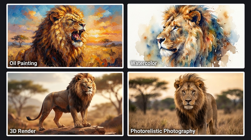
Professional-looking AI images almost never come from a single generation they come from a cycle of generating, reviewing, and adjusting the prompt based on what went wrong. Treating your first output as a draft rather than a final product is what separates polished work from average work.
A practical refinement loop looks like this: generate a batch of 4–6 variations, identify what’s working (lighting, pose, background) and what isn’t, then adjust only the specific words tied to the problem rather than rewriting the whole prompt. If the lighting is right but the composition is weak, change only the composition language. This targeted approach gets you to a strong result faster than starting over each time.
Many tools also support “image-to-image” generation, where you feed a previous output back in as a reference and refine it further. This is one of the most underused techniques among casual users, and it’s a core part of how professionals push an image from “good” to “portfolio-ready.”
Edit and Post-Process Your AI Images for a Polished Finish
Even a great AI-generated image usually benefits from light post-processing, because AI outputs can carry subtle artifacts, inconsistent color balance, or compression softness that a quick edit resolves. Skipping this step is one of the easiest ways to leave quality on the table.
A simple post-processing pass color correction, sharpening, cropping for stronger composition, and removing any small visual artifacts takes minutes but noticeably increases how “designed” an image feels. Free tools like Photopea or paid tools like Photoshop and Lightroom work well for this. Even basic adjustments to contrast and white balance can make an AI image look far more intentional than the raw output.
Build a Personal Prompt Library for Consistent Results
One angle most guides skip: the fastest way to consistently produce professional-quality AI images isn’t a better single prompt it’s building a reusable prompt library organized by style and use case.
Instead of starting from scratch every time, save your best-performing prompt structures in categories like “product photography,” “editorial portrait,” “moody landscape,” or “flat illustration.” When you need a new image in a familiar style, you adjust the subject and keep the proven lighting, composition, and technical modifiers intact. This is exactly how design teams maintain visual consistency across large volumes of content, and it dramatically cuts down the trial-and-error time that usually eats up a beginner’s workflow.
Over time, this library becomes a personal style system a shortcut that lets you skip straight to strong results instead of re-learning what works with every new project.
Frequently Asked Questions
Do I need design experience to generate professional-looking AI images?
No, but understanding basic design vocabulary composition, lighting, depth significantly improves your results. Learning a handful of terms like “rule of thirds” or “golden hour lighting” gives you far more control than relying on generic prompts.
Why do my AI images look flat or generic compared to others I see online?
This usually comes down to under-specified prompts that leave out composition, lighting, and style details the model needs to produce a distinctive result. Adding layered, specific language and using negative prompts typically closes most of that gap.
How many images should I generate before picking a final one?
Generating 4–6 variations per prompt is a reasonable starting point, since AI outputs have natural variation even with identical wording. Reviewing a small batch also helps you identify which specific prompt elements are working before you refine further.
Is post-processing really necessary if the AI image already looks good?
It’s not strictly necessary, but light edits color correction, cropping, sharpening consistently make outputs look more intentional and professional. Even five minutes of adjustment can be the difference between an image that looks “AI-generated” and one that looks designed.
Can I use AI-generated images commercially?
This depends entirely on the specific tool’s licensing terms, which vary widely between platforms and can change over time. Always check the current usage rights of whichever tool you’re using before using an image commercially.
Final Thoughts
Generating stunning AI images like a professional designer isn’t about finding a secret tool or a magic prompt it’s about applying the same structured thinking designers already use: intentional composition, deliberate lighting, iterative refinement, and a final editing pass. Once you build a personal prompt library around these principles, producing consistently polished images stops being a guessing game and becomes a repeatable process.

Leave a Reply